How to use your professionally designed materials as the design basis for your PowerPoint Presentation:
You hired a graphic designer to create your annual report (or other printed piece). To increase ROI, you can now upgrade the look of your PPT presentations by using the report as a guide. The goal is to continue using the graphic elements in the professionally designed piece in other tools you create in-house. In addition to PPT, you can upgrade graphics for web, social media, or HTML email campaigns, as well as printed pieces (both offset and digital). Your in-house materials will have increased credibility and be more compelling. And, having a consistent look across all of your promotional materials goes a long way to helping you increase brand recognition.
Copying the color palette from the professionally designed piece is a great place to start. When the designer completes your report, request a screen-optimized PDF to post on your website. You can then pull elements like the color palette from the PDF into PPT.
This first method I outline below assumes you have a brand standards guide with the RGB mixes or hexadecimal (hex) numbers for your organization’s signature colors. If you aren’t sure what RGB mixes and hex numbers are, no worries, I’ll explain. (If you don’t have an established brand book, look for our post later this week that explains how to use Color Picker Extensions.)
This first method assumes your designer followed your style guidelines for color when creating your report or other piece. Color is arguably the single most recognizable aspect of your branding, especially with online forms of media. Therefore it’s essential for brand recognition to keep your colors consistent throughout all of your printed and online materials. Whether it’s a flyer you create in-house or a professionally designed annual report, website, or Twitter post, ideally you should use the same set of colors for all.
Quick explanation of color variations
Important caveat: There is always the potential for small variations in color from one screen to another. In other words, the colors used in a given website may look slightly different when viewed on your phone, your laptop, and your desktop—or your colleague’s desktop. And, the way that ink colors reproduce vary a bit in digitally printed pieces versus offset printed materials. And also when using PMS colors versus CMYK mixes in offset printing. Furthermore, the type of paper stock or other substrate (such as fabric or vinyl) affects the appearance of colors to a degree. With all of these variables somewhat out of your control, it’s critical to maintain color consistency in all the ways that you can across all forms of media.

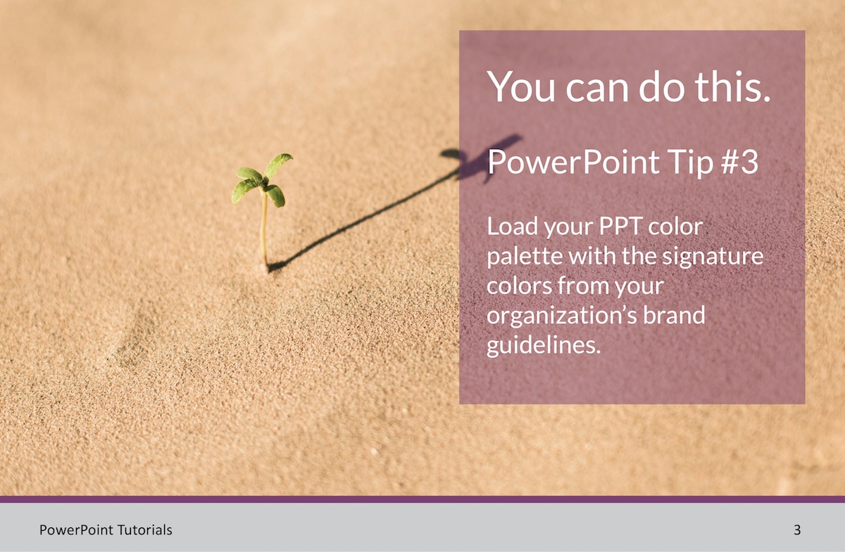
Step-by-step instructions for loading your color palette from your brand book or style guide into a PowerPoint presentation
1. Open your style guide and find the color section. (Again, if you don’t have written style guidelines, look for our next post on setting up a color palette in PPT starting with only a PDF or web page.)
2. Locate the hexidecimal colors, which are the color codes used for your website and other online materials. There will be a six-character code that starts with a hashtag for each color.
If there’s no hex, find either an RGB or CMYK mix. RGB will be a three-digit number; these are the colors that display on a screen. CMYK is for printing, and you may also see references to PMS colors in your style guidelines. CMYK color mixes will not be as color-accurate on screen as the hex or RGB, but they will get you in the right ballpark. Because each monitor is calibrated differently and our present objective is to create a slide presentation to be used on screen, you’re simply trying to get as close as you can to the look and feel of the professionally designed piece.
3. Assuming you have the hex code, open your PPT presentation and create a shape to which you can add color. To do this, visit your home tab and select the “Shapes” button, which is located toward the right side of the top navigation. Choose any shape you like and draw it on a slide. With it selected, go to the “Shape Fill” button located at the far right of the top navigation.
4. In the pulldown option, select “More Fill Colors” to open your color palette. The color palette has five possible settings indicated across the top. You want to select the second one from the left that looks like a mini diagram of sliders (if it isn’t already the default). Set the dropdown menu at the top to “RGB sliders.” In the lower right, you should see the field for “Hex Color #.” Copy or type the six characters from your brand book into this field. The shape you drew and the larger square on the left side of the “Colors” dialog box (near the bottom to the left of the eye dropper) should change to that hexidecimal color.
5. Drag and drop this larger square of color into the two rows of smaller squares to the right of it. This will add the color to the palette, so that you can use it again for other elements like shapes or text in your PPT presentation.
6. To use the colors you’ve added to your palette, click into the PPT slide of your choice and select the text or shape to which you want to apply specific colors. Again go to the “Shape Fill” button and then open “More Colors.” You should see all the colors you added in the rows of small squares.
You can also add squares for transparencies in this same way by selecting the element to which you have the transparency applied. In the color palette, drag and drop the larger square in the row of smaller squares. This will keep all of your colors and screens of colors consistent throughout your entire presentation and increase both your credibility and brand recognition.